Visual communication is a discipline which involves the use of images and visual elements for the purpose of communication, these could be photographs, Graphics, infographics, gifs, animations, motion graphics, films to convey an idea or information. Since the time of the cave man, the desire to communicate visually has been one of the foremost endeavours of the Human race. The Lascaux caves in France ( 17,000 year old) and the Bhimbetka caves in India are proof of this. Today in the Digital age, with the influx of social media and the hyper connectivity, Visual design has adopted a whole new meaning , and opens up a world of opportunities for visual artists. It is here that formal training becomes imperative to cut across the visual clutter that surrounds us and to achieve clutter breaking imagery. “ Paint me a picture with words and tell me a story with images”.
Designplays an instrumental role in visual communication. The use of design in visual communication is a creative process that combines visual arts and technologies to convey ideas. By critical curation of colour, type, movement, symbols, and images, the visual communication designer creates visuals to inform, educate, persuade, and even entertain a specific audience.
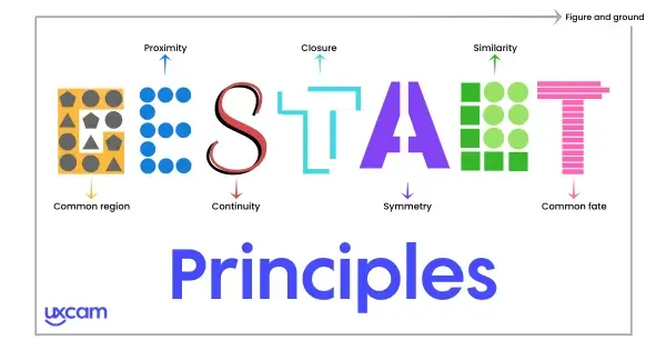
Max Wertheimer, a Czechoslovakian psychologist put together some fundamentals of how we see images and how we relate to them, this today is known as Gestalt Laws, and help in manipulating and constructing precise visual compositions.
Role of various design elements in visual communication:
Points and Lines: A point when going for a walk turns into a line, and this is where the story of Visual communication begins. Points direct the viewer's gaze and capture attention. They also accumulate to create complex components of visual communication like patterns, shapes, and forms. Similarly, lines decode complex information just through their width, empty spaces, composition, overlaps, etc.
Shapes and Forms: A line when it enters the realm of geometry starts to turn into shapes and then solid forms, and begins to adopt new meaning. Each shape, whether angular, geometric, or organic ( as found in nature), convey different sets of meaning.
Colour Palette: Coloursare powerful tools in conveying the key message of visual communication. Each colour connotes a different meaning and emotion. For instance, red can denote passion, anger or excitement and even love; orange can be for courage, playfulness while yellow can indicate sunshine, youthfulness and optimism etc. Here the context becomes paramount. and the way a visual communicator uses colour can be unique and original. Each time a colour can redefine its context, depending on how the Designer approaches it. by playing with its Tone, hue , tint, shade and saturation.
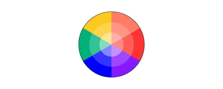
Hence, the choice of a single colour in the entire palette can change the emotion, mood and energy of the image. Similarly, the choice of colour scheme influences the key messaging of visual communication. Concepts of Mono chrome , complimentary colours , tertiary colour, contracting colour etc are used critically to achieve a desired effect. There is a huge role that Isac Newton has to play in the whole business of colour. More about that later.
Typography: Since the invention of Guttenbergs printing press, Type design has become a huge stream within Communication design. Today each brand has its own fonts to make them distinct from their competitors, which was not the case a decade ago. Each type of font leaves a particular impression in the minds of the viewers. Each font category determines the mood and evokes a specific emotion. For instance, Serif fonts are traditional and considered classic, as they were derived from carving on stones. , while sans-serif fonts are modern, clean and indicate minimalism.
Layout: The kind of placement of various elements in visual communication connotes a meaning through hierarchy, emphasis and sizing. The overall representation of various elements in artwork through thoughtful positioning and sequence of text and images in publication design, brochures, pamphlets play an important role in communicating and reinforcing the key message of brands. The elements to be emphasised upon in artwork are placed in a prominent position to capture the viewer's attention. Similarly, Orientation, which implies the position or direction of various elements of visual communication in relation to the other, gives a proper symmetry of the entire design and communicates the message more effectively.
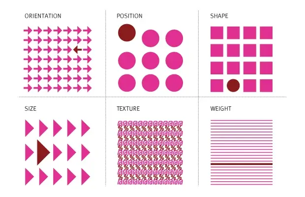
Texture: Texture refers to the feeling you get while you touch a surface of a substance. Broadly, there are two types of textures- tactile and visual to recreate this feel virtually. A tactile texture, for example, has 3D characteristics, and you need to touch it to feel it. For instance, you can feel that a mattress is soft only by touching it. In contrast, visual texture merely evokes a 'feel' on viewing it. Additionally, a combination of shadows.
Space: The usage of space influences the viewer’s perspective. Broadly, a positive space refers to the space covered by the main object in the artwork; negative space denotes the leftover space in artwork or illustration. Excess positive space creates flashy artwork, while extra negative space leads to dull artwork.
Examples of Powerful Visual Communication
Airbnb- The company uses people-centric imagery and a bold pink logo to convey a nomadic life and showcase its offerings.
GoPro- The rich photographs in GoPro advertisements and social media posts aptly convey what it stands for.

Bumble- This dating app makes conscientious use of colours to reinforce its key messaging. A combination of yellow with white and black font is evident from its marketing collateral. The brand’s bold colour choice exudes optimism, imagination and communication, typical of a date and a dating app.

Powerful visual communication is based on a practical application of its principles and their relationship with each other. When used effectively, it helps convey all information through just a simple visual. Communication designers are mandated not to create just beautiful artworks but also impactful ones that help communicate a larger message and drive a positive impact, such as boosting impressions, engagement and sales.

