This quote is often attributed to Thomas Watson Jr., the son of Thomas Watson, the founder of IBM. And while the quote sounds good, and certainly feels good—is there actual truth behind it
Design of things (and here we’ll assume them to be tangible commodities instead of abstract art) exists to connect a consumer to a product so that they can use it in an intuitive, understandable way.
But this definition of design is traditional, and in the modern world, outdated. Design isn’t simply a vehicle to take a person from point A to point B anymore - it’s the entire journey!
Design as a field, in all its broad, mind-boggling ways; encompasses a whole gamut of disciplines, including (but not limited to) fashion, interior, graphic designing, product design and even visual communication design! The common thread between all of these things, of course, is a basic underlying assumption of the function of design.
Long gone are the days where one assumed design, and by extension, designers to be earthier—less weird —versions of high-strung artists or painters sitting atop lonely peaks of creative genius. Today, big brands value design thinking more than the average technical or business skills.
Now let’s take a closer look at a global business that’s built its consumers, supporters, fans, and of course, profits, from it’s well-crafted, rigorously honed and constantly polished design. Moreover, they have elevated their design into a potent tool of visual communication, and hardly, if ever, use words to convey their brand value.
The Apple Appeal
It could be said that the iPhone (along with instant messenger Whatsapp—but that’s a story for another day) were the icebergs that sunk BlackBerry’s Titanic. The iPhone wasn’t the first smartphone, and it’s certainly not the most popular (13.9% market share versus Samsung’s 21.4%, according to this IDC report ) But it’s enduring presence has made it—just like the Macintosh computers and laptops before it—a 21st-century phenomenon.
Apple’s stringent adherence to “design is king” has shaped not only its products but has leaked over into other aspects of the consumer experience as well. Through careful marketing (the late 2000s “Get a Mac” ad campaign comes to mind ) and an instantly identifiable, (but not static,) product, brand and logo design, an Apple product is now a status symbol. It’s a part of a conscious image construction for all: the youth, the professional, the creative genius, the innovative thinker, and the enigmatic CEO.
An Apple product isn’t just cool (and expensive). It’s also a representation of the class its consumers belong to whether economic or social.
Apple is known for its minimalist, smooth and elegant look—be it its iPhones, Macbooks, or iPads; and that’s a theme they run with, for both hardware and software. The air they give out is a cool, calm, and collected one, perhaps with a tinge of arrogance that can be, in the world of facts and figures, rather misplaced (iOS has 13.9% market share versus Android’s 82.8% according to this IDC report .)


How then does Apple manage to instill a feeling of smug superiority in their products—and through them—their customers?
The answer is simple: design.
The iPhone has a strong visual communication component. Every element of design communicates something about the brand and its users.
Let’s take a look at how Apple manages this with a few examples.
The Functionality of its Design Choices:
1. The Menu Screen
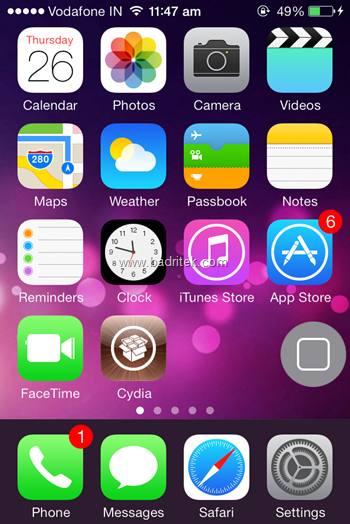
Upon unlocking an iPhone, one is presented—straight away!—with all the applications, and folders on the phone, right on the home screen. There can be, of course, multiple home screens, accessed by swiping left and right, but this no-nonsense presentation of everything from the get-go is part of a conscious design choice.
Unlike Android Phones, where the menu tray (the screen[s] that house all the apps) can be accessed by a touch of another button to open it, this immediate access is an example of functional design. Why go through an extra step when it isn’t required? What’s the requirement of keeping the home screen clear (like Android does) when the unlock screen of an iPhone does the same?
2. The Home Button
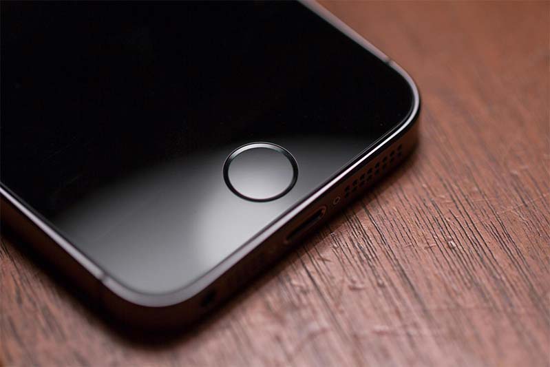
All iPhones possess the simple, round button at the bottom of the phone, which immediately takes the user from whatever app they’re inside to their home screen. It’s big, and dignified for a reason: it’s a part of an iPhone’s distinctive “look.”
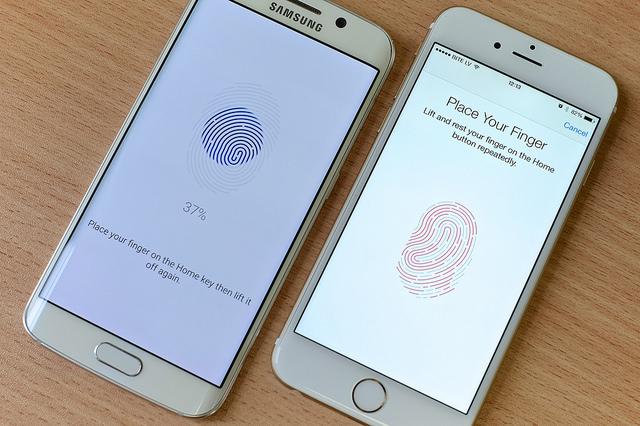
After the iPhone 5s Apple went one step further and added a thumbprint scanner to its Home button: boosting security, and creating a sense of personalized ownership, without losing out on its trademark “look,” all in one go!
In fact, Apple is so enamoured with this design choice that its new HQ (still under construction) is clearly inspired by it.
The Connection of its Design Choices
1. The Apple Logo
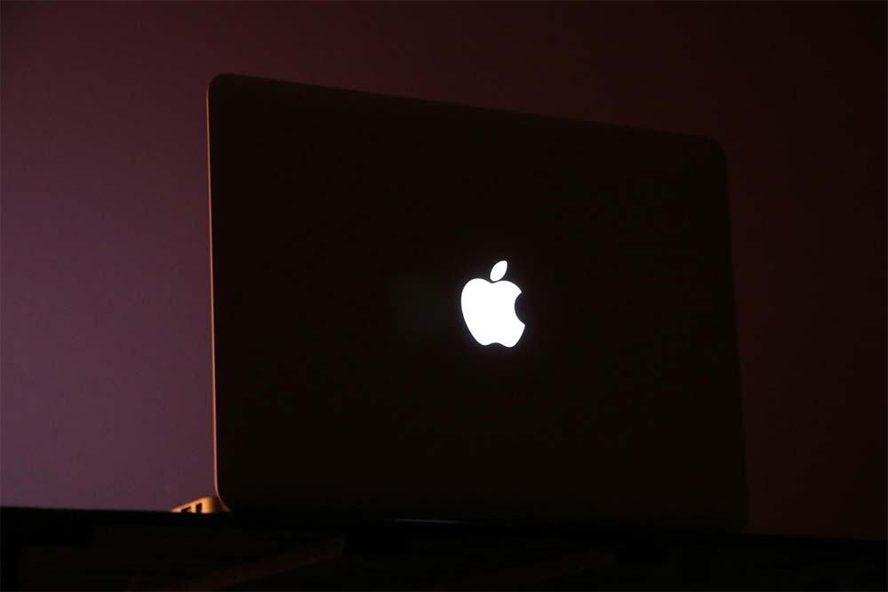
Apple’s distinctive, well, apple, is a creature of a different proportion altogether. Not because of the inherent design of the logo itself, but the way the logo has been implemented into its products.
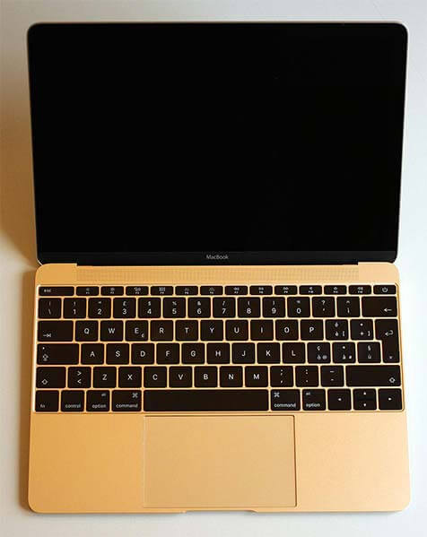
The illumination of the logo on Macbooks is a masterstroke for the brand. Not only does its illumination create a sense of the user being busy with important, and possibly earth-changing work, but also sets it apart from its plain-Jane counterparts across the other brands.
This proud showing of peacock feathers isn’t just Apple boasting about itself, but giving its user something to boast about too! Not to mention, the subsequent endless possibilities that Apple fans use the glowing logo to be the centerpiece of their laptop art, which could both be a harmless self-expression, or part of a more conscious image creation, or both.

2. Rounded Edges

Apple fought a long and bitter battle with Samsung in the US to patent the rounded edges of a handset to be allowed on iPhones only. Their passionate belief that those rounded edges are theirs give us an idea of how much they value the look of an iPhone to be different from the rest.
The results of the legal battle were immediate: Samsung faced an import ban in the US, but the iPhone 6 was met with disdain from earlier diehard fans simply because: “it looked like a Samsung. ” This was thanks to Samsung using its pesky rounded edges in earlier phones, and when the iPhone finally caught up with a larger screen size with the iPhone 6, the two products did, indeed, look the same. The emotional connect of those consumers to the rounded edges is baffling to the extreme—and yet, that’s where a good design will get you!
Conclusion
Apple’s success isn’t the only example of the value of design (IBM’s focus on design remains the hallmark in innovation) nor will it be the last.
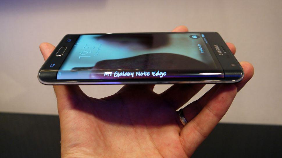
Samsung, which started as a company offering inexpensive replacement products, changed its way of thinking thanks to its then chairman Lee Kun-Hee and now has the leading market share in the smartphone category. Their innovative “edge notifications” lets us know that design is definitely a priority for them.
Google’s another superstar when it comes to design, and its fascinating ‘Project Ara’ which is still currently underway – which may change the way we use and adapt smartphones with the advancement of technology while keeping in mind our personal needs.
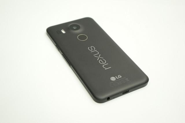
Until Project Ara surfaces, however, they continue to impress with their Nexus smartphone line. The latest two models finally jumped onto the fingerprint scanner bandwagon—but with a twist! Google put the scanners behind the phone instead of in front (like everybody else) and aside from it being an interesting quirk for the brand, it provides easy access unlocking with the user’s index finger!
These companies and their products are only one part of the current design revolution. As we move ahead, more brands will start to exploit the principles of visual communication. In a future with interlinking commodities, consumers, and experiences: design will be the glue that holds it all together!
PLAGIARISERS BEWARE!
This Website and its contents are subject to copyright protection under the Indian Copyright laws and, through international treaties for/ of other countries. The copyright in the contents and materials available on this Website as a whole is owned by the IIAD. However, the copyright in some contents and materials incorporated within this Website may be owned by third parties where so indicated. No part of the contents or materials available on this Website may be reproduced, licensed, sold, published, transmitted, modified, adapted, publicly displayed, broadcast (including storage in any medium by electronic means whether or not transiently for any purpose save as permitted herein) without the prior written permission of IIAD. The visitor may view this Website and its contents using Web browser and save an electronic copy, or print out a copy, of parts of this Website solely for visitor’s own information, research or study, provided the visitor (a) do not modify the copy from how it appears in this Website; and (b) include the copyright notice “© 2014 to 2018 Indian Institute of Art and Design (IIAD). All rights reserved.″ on such copy.
IIAD’s logo/ name should never be removed from pages on which they originally appear. The webpages should always appear exactly as posted without variation unless the prior written approval of the Organisation is obtained.

